通过SandRibbon,您可以在您的应用程序中使用功能强大的最新的Office 2007用户界面,SandRibbon为您提供了大量强大的功能:提供完整的可拆分的Ribbon程序功能块,脉络关联标签(contextual tabs),增强的屏幕功能提示(enhanced screentips),弹出式菜单(rich popups),图表菜单(gallerie),即时预览(live preview),多种自定义的配色方案,最近使用的文件列表,动画和其他功能。该控件支持专门的直接设计时,可以方便得插入在任何的程序中。
Our WPF implementation of the Microsoft Office 2007 Ribbon user interface is lightweight, robust and provides all the features necessary to implement the new user interface paradigm in your own applications.
We make extensive use of WPF features such as animations, styling and templating to implement nearly every feature of the Office 2007 user interface with great authenticity.
Dynamic Resizing
With SandRibbon it is easy to specify multiple sizes for each group you define on the ribbon. When these sizes are applied you can make your buttons, galleries and other controls rearrange and resize themselves in turn to create different combined sizes. We provide buttons which can assume different sizes, a layout panel which can form three lines instead of two with its children, a layout panel which attempts to squeeze children into as little space as possible and ribbon galleries which can condense themselves to just a dropdown button.
ICommand and RoutedCommand Integration
The buttons and menu items you'll use in SandRibbon both fully support being bound to commands with the WPF commanding infrastructure. In this way, it is easy to create a ribbon with fully-functioning buttons that perform editing or application commands without writing a single line of code.
Commands are a very robust means of input and application logic, and our demonstration application shows how to use them with SandRibbon.
Application Button
The application button is our name for the Office button in Office. It is a large, round button at the top of the window that presents a dropdown containing functionality previously found in the File menu. The application button typically shows the application icon and is rendered as a glassy sphere. Double-clicking the button closes the window.
Quick Access Toolbar
Most applications will feature a quick access toolbar alongside the ribbon, which can be placed below or above the ribbon itself. This toolbar can contain the same types of items as the ribbon, and typically presents commands that should be available no matter which ribbon tab is open, such as Save and Undo.
Contextual Tabs
Of all the ribbon tabs you have configured for your application, you may want some groups of tabs to only be visible in certain modes. For example, a tab dealing with picture editing should only be visible when a picture is selected.
In SandRibbon, you configure a number of Editing Contexts on the ribbon, then simply associate any number of tabs with an editing context. Those tabs will no longer be visible unless that editing context is active. Setting the active editing context is one method call. Contextual tabs are displayed slightly differently and the color of their editing context is used to differentiate them.
Buttons
Of course, at the core of the ribbon are the buttons that are eventually presented to the user. Buttons can be activated with the keyboard or with the mouse. They are usually assigned a normal size (large, medium or small) and can automatically condense themselves smaller than this when the ribbon is shrunk by the user, if desired. Buttons are either displayed standalone or in a button group, where they gain a different appearance.
When a popup is associated with a button it gains a dropdown arrow next to it. The dropdown can be either integral, i.e. clicking anywhere on the button opens it, or separate, i.e. clicking on the button activates the button and clicking on the dropdown shows the popup.
Just like in Office, the dropdown indicator for a vertical button can actually be integrated right into the text, to save space. Small features like this allow better overall presentation of your user interface.
Right-to-left Support
When writing software it is absolutely essential that it fully supports right-to-left reading order for those locales and languages that demand it (such as Arabic). WPF provides a great platform on which to implement full right-to-left support, and when using SandRibbon you can be assured of correct mirroring when required.
Advanced Office-style popups
Popups are used throughout the product, they are normally associated with a button or menu item but are also used by galleries, collapsed ribbon groups and the ribbon itself when minimized. You can use a special kind of popup as a relacement for the stock WPF context menu, which allows you access to the more advanced controls in the SandRibbon library.
Typically along with a menu, you could have headings, a color picker or a gallery in your SandRibbon popup. You can also include any other standard WPF control.
Galleries
The Gallery control offers a scrollable window on to a collection of gallery buttons. This allows an interface where a group of buttons or other choices is displayed as a scrollable list. A special type of gallery can be used in a ribbon directly, but they are generally used in popups. When placed in a ribbon you can choose to associate a further popup with your gallery, where the items in your ribbon gallery will be made available too.
Gallery buttons are special buttons that allows easy owner-drawing by the host application. In this way your interface can provide visual cues to the user of what the effect of clicking each button will be. For example you might want a gallery to display all the different types of underline styles that are available, like in Microsoft Word. You would simply fill a gallery with as many buttons as needed and respond to their events to draw a preview of each option, which we do in the demonstration application.
Live Preview
Live preview refers to the ability for your application to show a preview of what would happen to the user's selection if they clicked an item, as they hover over it. SandRibbon makes this very easy by exposing an event and passing the control being hovered over to it. Your application passes an instance of a class implementing a simple live preview interface back to SandRibbon, which allows the library to "undo" the preview as the user hovers over other controls or stops previewing altogether. This API is robust and is taken advantage of in the simple word processor sample application.
Resizable Popups
Some popups will contain scrollable galleries, and in this case it is natural that the user may want to resize the popup if they have a lot of screen space, so they can see all the options at once. SandRibbons allows you to specify that a popup should be resizable, either vertically or both horizontally and vertically. Once specified, the popup shows a resize bar that the user can drag.
Menus in Popups
With the advent of all the new widgets available in ribbon layouts it is sometimes easy to forget that the menu control is still the backbone of all popups. In the Office 2007 user interface menus are still used extensively, the only difference being that they are often mixed with other controls in a popup, and multiple menus in one popup is not uncommon - for example, separated by a color picker control.
Since a menu is just another type of control, they can be laid out in a strip with (for example) galleries and headings around them. Of course, a popup with a single menu control is perfectly possible and you will probably use this configuration a lot in your SandRibbon applications.
Color Pickers
The color picker is a control usually displayed in popups. It is a self-contained control that has a collection of colors which the developer adds to it. These colors are shown in a horizontal strip. You can also specify that a number of color graduations are shown, in which case light and dark variations of each color are also made available for selection. These are all presented in an intuitive fashion and the control is very easy to configure.
Color Schemes
SandRibbon ships with the three color schemes from Office 2007 (Blue, Silver and Black) as well as a System theme not present in Office, which takes its colors from the standard system colors. They are all very attractive schemes and you can choose any one for your application. You can also allow your users to make the choice. Blue is the default, and you can see them all on the screenshots page.
RibbonWindow
By choosing to inherit from RibbonForm instead of Window, your windows will adopt the custom shape seen in Office 2007. This will give them different characteristics such as more rounded corners and themed window frames, but more importantly will allow the ribbon to nicely integrate itself into the titlebar area of your window.
When running on Windows Vista, your applications will automatically enable Aero Glass behind the application button and quick access toolbar.
Extensibility
The default styles and templates that ship with SandRibbon integrate with the four normal color tables: blue, silver, black and system. It's also easy for your designers to create an entire color scheme for use within your application and apply it to SandRibbon. In this way, you can ensure a unique look and feel for your application while still being immediately recognisable as using the Office 2007 user interface.
When a custom color scheme is not enough, you can choose to completely re-template all the SandRibbon controls. We make all the primitives we use available for people wishing to heavily customize the library.


 首页
首页 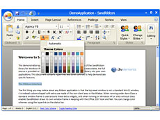


 相关产品
相关产品 授权相关问题
 微信
微信 在线咨询
在线咨询


 渝公网安备
50010702500608号
渝公网安备
50010702500608号

 客服热线
客服热线